
Forex data visualization through OHLC/Candlestick charts is on the go-to list of most financial and price analysts. Usually, foreign exchangemarket data requires better clarity, especially when the exchange rate movements are volatile.
The forex data in tabular forms received through MS Excel files become easy to understand when plotted on a candlestick chart or graph. However, is it practically possible to convert the forex data in an excel sheet into candlestick charts and graphs?
The OHLC chart (candlestick) shows the exchange rate movements across the vertical axis and time frames on the horizontal axis. Thus, it becomes easy to analyze the movements and identify the candlestick patterns.
Converting OHLC to a chart makes the data visualization suitable for all investors. That way, analysts can conveniently make out the turning points on the chart to manage risk and make informed and data-driven trading decisions.
This article takes you through some simple steps to plot candlestick charts and graphs using our forex data. Manually creating candlestick charts and graphs may be painful. MS Excel has some incredible charting features that ease this process for you. So, keep reading till the end to understand the sequence.
Sign-up for free
We offer free forex data download options to help you access unbiased data. You can sign-up to our platform for free by logging on to this link:
https://tradermade.com/download-forex-data
You receive an automated confirmation email as you sign-up. You can access the dashboard using the link in the email you receive. The dashboard looks like this:
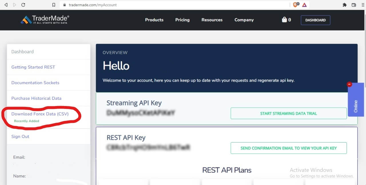
The dashboard is the centralised place where you can choose to obtain forex data in various delivery methods. You can subscribe to our data API plans, purchase historical data, access our tutorials, get an API key, access live-streaming data for various currency pairs, and much more. In this article, we will concentrate on plotting graphs using historical data in Excel.
Download Data
All you need to do is to click on the ‘Download Forex Data (CSV)’ option (marked in red in the image above). The link takes you to our ‘Download Free Forex Data’ page which looks like this:
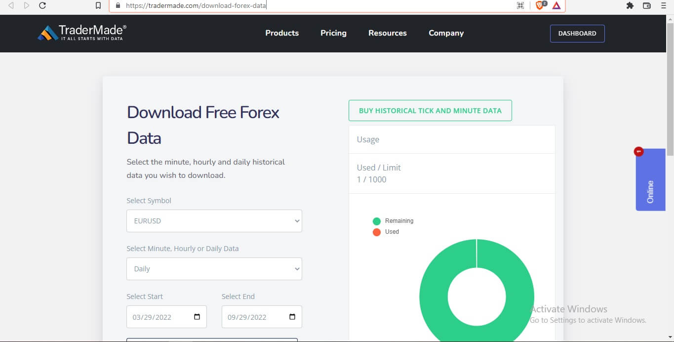
Please follow some simple steps to download forex data from our platform. Firstly, select your desired options choosing through the dropdown menu for:
- Currency pair
- Period (Minutely, Hourly, Daily)
We provide:
- Two days history for minute data,
- Two months' history for hourly data and
- For daily data, you get 15 years of history for free
- You get 1000 monthly requests for free.
- Start and End
Please select the desired currency pair and the period for which you want the historical forex data. For your convenience, we cover all popular currency pairs.
When you set all the options, click the Download button. The download occurs within a few seconds.
Open Downloaded Excel File
You get an excel sheet with the data for the desired options you choose.
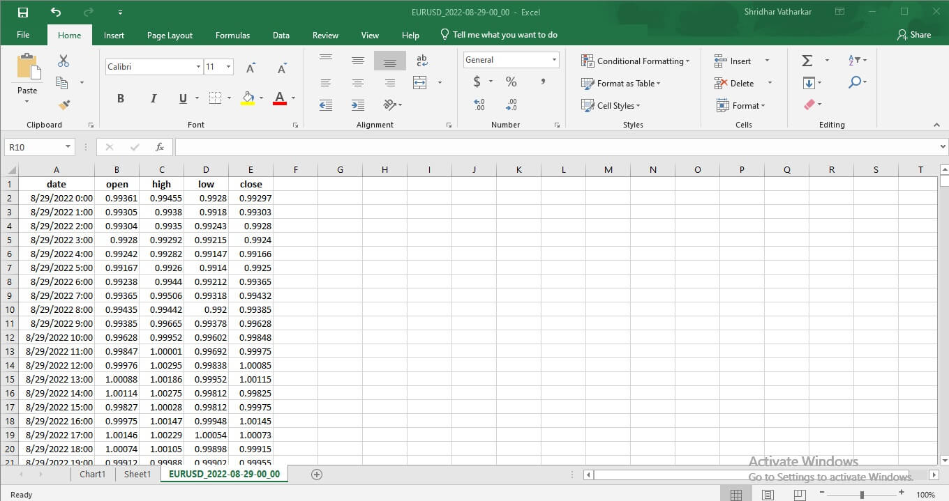
The excel sheet shows open, high, low, and close (OHLC) prices within your selected timeframe. Most importantly, we source forex data from reputed banks, OTC brokers, and institutions and curate it to provide unbiased rates. You don’t need to worry about the accuracy and reliability of the forex data you receive.
Steps To Plot A Candlestick Chart In Excel
Now you have the values for your desired currency pair on an excel sheet. It would be challenging to manually plot a graph keeping the time along the X-axis and the values along the Y-axis. Fortunately, MS Excel has helpful tools to plot candlestick charts from the data on the sheet.
Let’s take a look at the steps to plot the candlestick chart in excel:
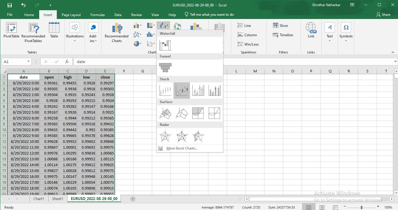
Step 1: Select The Data
Select the data for which you wish to create a chart. Notably, the interval will be along the X-axis, and the exchange rate movement will be along the Y-axis in the candlestick chart.
Step 2: Select The Charting Feature
MS Excel has an inbuilt feature that allows you to plot different charts and graphs. It is vital to choose the correct options to get the required outcome.
Click on Insert > Charts > Stocks > Open, High, Low, Close.
The following image helps you navigate to the suitable options from the taskbar.
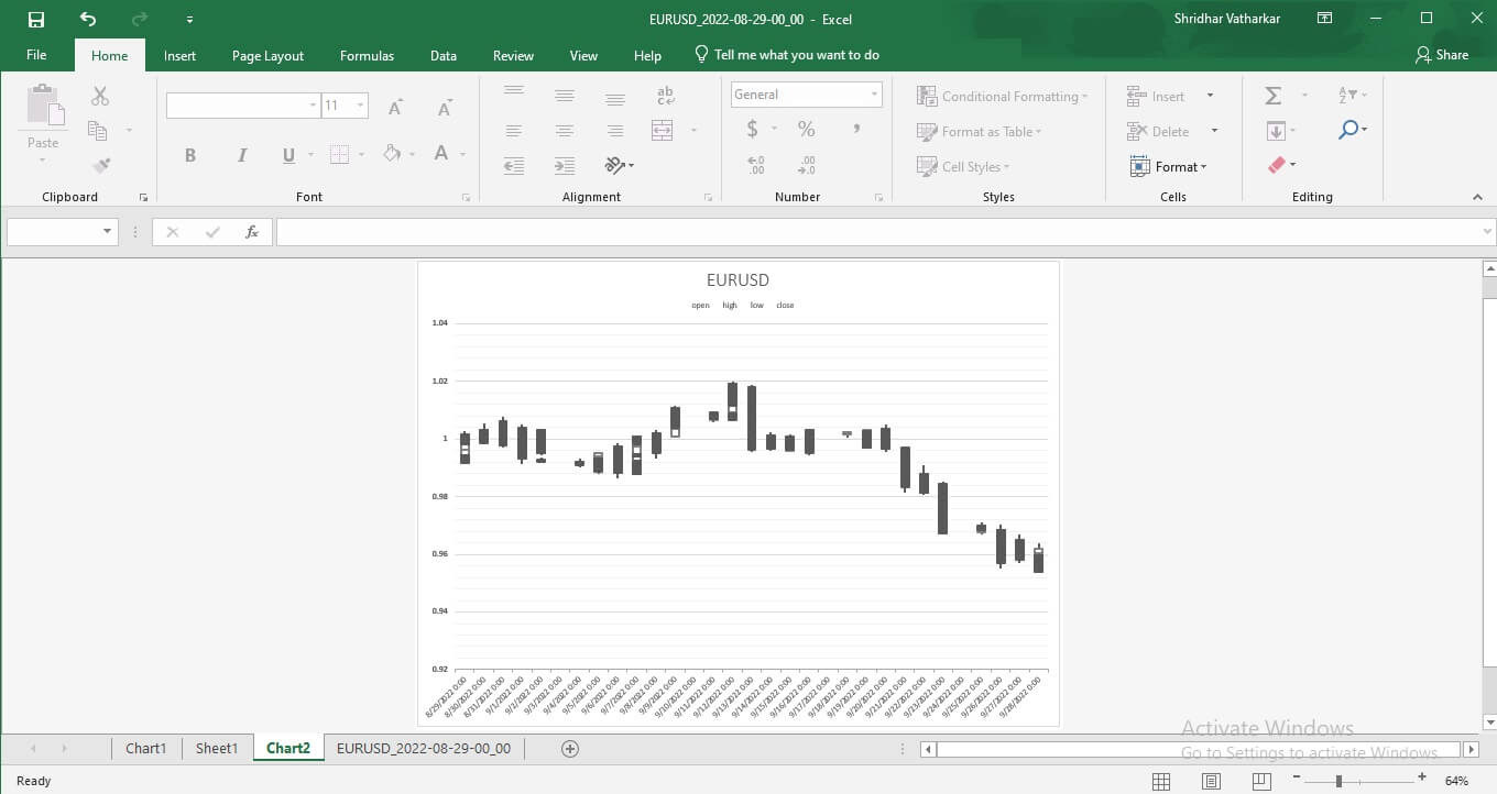
Step 3: Get the OHLC Chart
You will get a chart showing respective OHLC candlesticks for the selected data.
Step 4: Move Chart
You can take this chart on a separate sheet by clicking on the ‘Move Chart’ option under the ‘Location Tab’ in the upper right corner (Appears as you click on the chart).
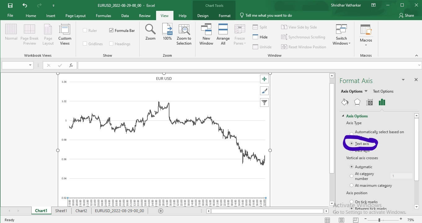
Step 5: Convert To Graph
You can select the bottom axis and select ‘Text Axis’ from the menu appearing on your right. (Marked in blue in the following image, for your convenience). The candlestick chart converts into a graph like this:
Thus, you can plot OHLC/Candlestick charts in excel using our forex data. These easy steps will help you get the exchange rate values on the excel sheet into a visual form.
Candlesticks/OHLC on the chart show the exchange rate range between high and low through the vertical line. A thicker column indicates the price movement from open to close.